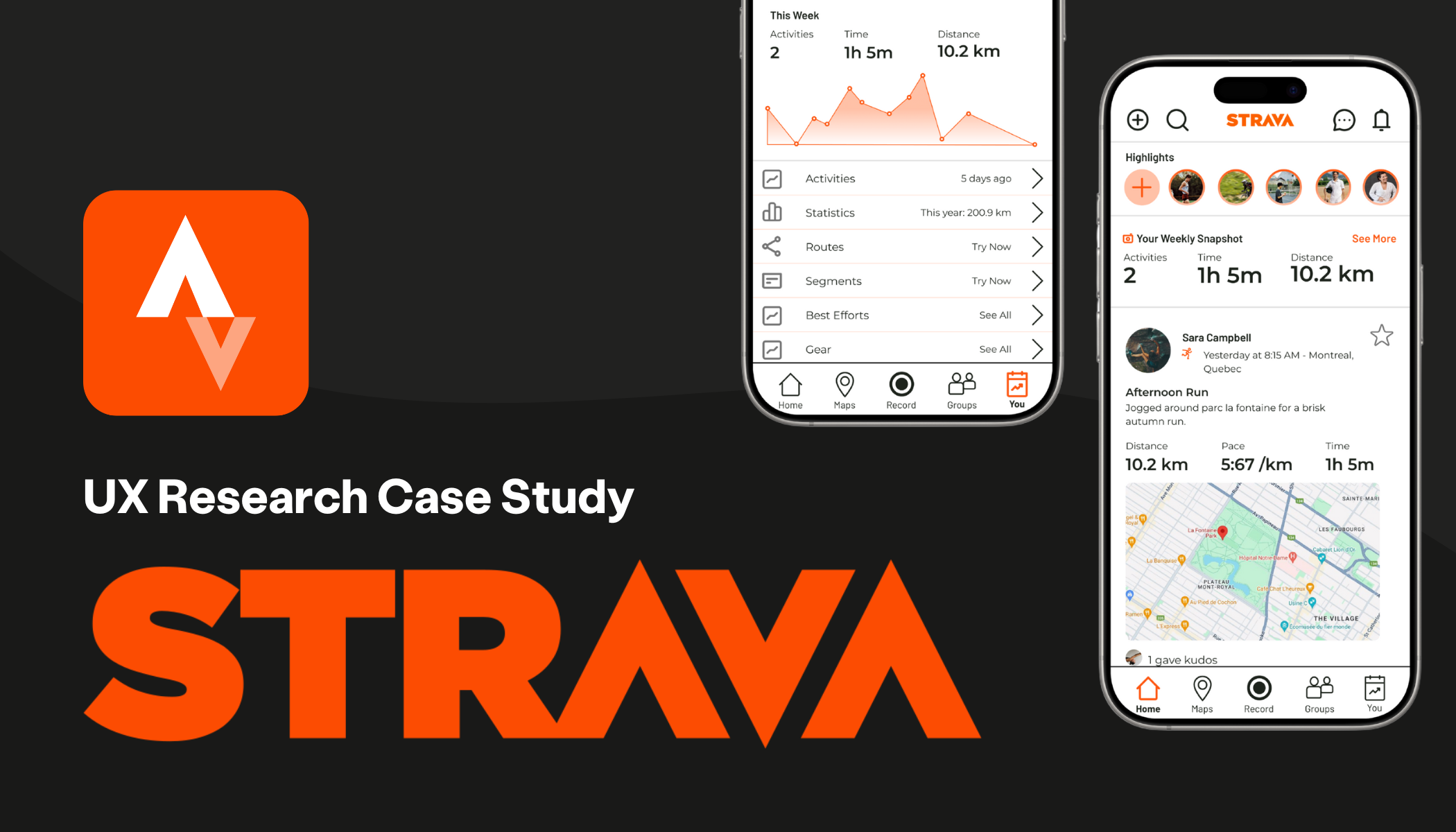
Strava: Run, Connect, Repeat
Enhancing social-driven features and improving navigation
INDUSTRY: Fitness, Social Platform
RESEARCH: User Interviews, Wireframe Testing
ROLE: UX Researcher & Designer
PROJECT: Redesigning Strava based on research-driven insights to improve intuitiveness and enhance social functions
DELIVERABLES: User Testing Script, Empathy Map, Persona, User Journey, Wireframes, Interactive Prototype
Project Overview
Context
Strava is a fitness app that allows you to track workouts, stay up-to-date on your friends’ activities, join running groups and view your personal fitness data. Jokingly called ‘the new dating app’ Strava has evolved into more than just a fitness app, but the must-have social media for fitness junkies.
Problem Statement
Strava users may find the app hard to digest and navigate, especially as a new user. The app houses a lot of data and users may find it difficult to check their friends’ activity and view their own personal fitness data.
Possible Solution
Make information more digestible and bite-sized with features like the ability to highlight an activity as the main workout of the day. Add specific tweaks in app architecture and navigation to help users connect and find information faster.
Research Methods
User Interviews
Conducted 4 user interviews with a semi structured script. Based on my findings (see key quotes below) developed HMWs and JBTD to address user needs in my solution.
-
Make your own workouts and data easier to find?
Foster connecting with friends and staying in the loop?
Decrease frustrations with navigation?
-
Stay connected with friends
Encourage yourself to stay active through social sharing, data-driven progress, and activity tracking motivations
Save time on scrolling and navigating with an easy-to-use interface
-
Declutter Activity Feed
Redesign App Map Navigation
Create features to concisely organize and visualize information
Pain points:
I surveyed 10 Strava users and found 60% used synced devices that auto-upload activities.
These 'filler' activities makes it more difficult to find the main workouts of your friends and leads to frustration from scrolling.
#1. Hard to see and find friends’ activities.
#2. Accessing your profile
Currently, the only way to view your personal work out activity stats and activity log is by clicking the tiny profile picture to go to your profile page.
What I did:
New: Main Activity Highlights
Added ability for users to feature their main activity of the day in a new section.
Moved: Favorite visibility
Moved Favorites Star to activity cards instead of under the 3 dot menu so users can prioritize who they see first on their feed faster.
New: Friend Leaderboard
Replaced ‘dead space’ Active page with Friends page under Group tab and added new leaderboard feature.
Moved: Profile Page
Reorganized app map architecture and moved the profile page to the secondary top navigation bar. I also redesigned the profile page to reflect the new highlights feature.
Key Screens: High Fidelity Mockups
Interactive Prototype
Here are the high fidelity screens I developed to show how my solutions function as an interactive prototype.
